
First, we were instructed to build our palettes. Basically, find colors you're drawn to (for any reason) and make note of them. I ended up browsing the site Colour Lovers and pinning my favorites to my Wardrobe Architect Pinterest board. You could use Photoshop or the website Kuler, but I liked Colour Lovers because it was easy to use with Pinterest. Although, no matter what site I used, the colors look different on my computer vs. my iPad, so take that with a grain of salt.

I ended with some very confusing choices. Basically it was all blues/greens, and shades of pink. With very few neutrals thrown in there. But Sarai didn't leave us hanging, because the next week she provided some guidance on how to group your colors and make sense of them.

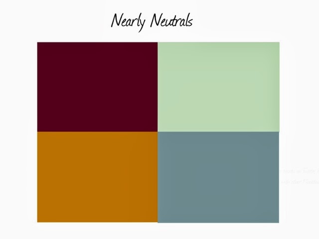
The categories she outlined were neutrals, nearly neutrals, statement colors, and metallics. I went back through my original colors and grouped them using the app Moodboard (Lite, which is free).
If you love a lot of statement colors, you'll need a bigger wardrobe because you can't get as much mileage out of them. It seems simple, but it's something I've struggled with even though I didn't know why. Also, I'm susceptible to mixing statement colors when they should probably be paired with neutrals or nearly neutrals.
If you love a lot of statement colors, you'll need a bigger wardrobe because you can't get as much mileage out of them. It seems simple, but it's something I've struggled with even though I didn't know why. Also, I'm susceptible to mixing statement colors when they should probably be paired with neutrals or nearly neutrals.
Which leads me to my second problem (hey, you can't fix what you don't acknowledge, as Dr. Phil would say). Neutrals are hard for me. I have a light complexion and light hair, so colors like white, peach, and tan just wash me out. Darker neutrals like black or brown work better, but in the dead of winter when I never see the sun, that means a pretty stark contrast with my skin.

I didn't make a board of metallics because I hadn't pinned any in the first place. I typically use metallics in shoes, if at all, and then mostly silver as I think gold and bronze can wash me out like light neutrals.
So I've spotted some trouble areas and can now make a more conscious effort to fix them. More grey, more dark or medium neutrals, and be more careful about choosing statement colors. Hopefully next week Sarai will introduce a magical formula I can follow (2 neutrals + 1 statement = clothing nirvana!).
So I've spotted some trouble areas and can now make a more conscious effort to fix them. More grey, more dark or medium neutrals, and be more careful about choosing statement colors. Hopefully next week Sarai will introduce a magical formula I can follow (2 neutrals + 1 statement = clothing nirvana!).
How is it going with your Wardrobe Architect project? Making any new discoveries?
No comments:
Post a Comment
I would love to hear from you! Please feel free to comment below.